

Overview
Company
NFTee.ai: A startup in Fintech, AI/ML, Web3, Blockchain, Crypto
Role
Product Designer
Team
6 Developers, 1 Product Manager, 3 Designers, 2 Marketers, 1 Legal
Platforms
Mobile (Android & iOS)
User Research & Key Findings
I conducted a mixed-methods study, combining secondary research (articles, industry reports, WCAG 2.2 Guidelines, and competitive analysis), quantitative research (a survey with 150+ sample size), and qualitative research (11 user interviews and 6 usability tests).


Top Pain Points
Using the key findings from surveys, interviews, and secondary research, I discovered three primary pain points.

Insecure
Many users expressed distrust in the wallet, fearing it could be easily compromised, and were ready to bounce to another competitor.

Cluttered
People felt that the app was cluttered and overwhelming, especially when compared to other competitors like MetaMask and Venmo.

Outdated
People found the wallet outdated and did not convey innovation, modernity, and growth. They also said the color scheme made it hard to see.
Actionable Design Goals
I converted our key problems into opportunities to solve for during the redesign.
Insecure → Secure
How might we optimize user flows to be intuitive and reliable, minimizing friction while prioritizing user needs like security and ease of use?
Cluttered → Relevant
How might we ensure the right content is easily accessible, improve the discoverability of key features, and eliminate underperforming ones?
Outdated → Modern
How might we modernize the user interface to align with our goals and user base, integrating the new design system and prioritizing accessibility?
Secure Log-in

User Flow and Wireframes for Signing up and Onboarding
Problem: The initial user flow required voice-only login, which many users found unsafe, untrustworthy, and inaccessible. To address this, I did:
Cross-Functional Collaboration: Worked with key stakeholders to ensure alignment on goals and technical feasibility
User Research and Competitor Analysis: Analyzed research and other payment apps to identify key features and flows
User Flows Design: Ideated and presented optimized user flows to stakeholders for alignment and approval
Solution: I proposed a multi-option phased rollout to address these concerns. Voice ID would be an optional 2FA in the first phase to gather more data and enhance our system.
Relevant Layout
Prioritization: Used a weighted system to rank pain points and solutions based on impact and constraints, balancing the need for intuitive and useful features with the project’s deadlines and limitations.
Phased Rollout Strategy: Proposed a phased approach for new features, balancing constraints with the opportunity for user feedback and iterative improvements.

Phase 1: Homepage Sitemap Redesign
Modern Interface

Design System Snippet with Color, Typography, UI components
Noticing the lack of a design system for SpeakWallet, I built a design system from scratch by analyzing NFTee's current applications and SpeakWallet design.
The scalable design system unified colors, typography, and UI components, improving usability and brand identity while simplifying future design and development.
Iterations
The app underwent multiple iterations before reaching a final design ready for development and launch.

Quick Log-In Method: Before vs. After Engineering and User Feedback
Security: Login Method
Working with Engineers:
I initially proposed email recovery for forgotten accounts, but engineers raised privacy concerns with non-custodial wallets, where users must have complete control their funds. Time constraints also made this solution unfeasible. I pivoted to direct password creation.
Usability Testing Insight:
The initial plan was to use passwords gave users more control over their security, testing revealed challenges with password recall and UI readability. I switched to a passcode system, enhancing both security and overall user experience.
Relevant Layout: Homepage
Usability Testing Insight:
Users felt overwhelmed by choice overload, so I simplified the interface by refining key CTAs, such as merging the Pay and Request buttons. To improve icon clarity, I also replaced the person icon—often mistaken for a profile—with an icon of two people to better represent contacts.

Homepage Layout: Reducing Choice Overload and Icon Confusion

'Send Money' Page Iterations: Enhancing Accessibility, Usability, and Design through Continuous Feedback
Modern Interface: Design Iterations
Design Sprints and Review Insights:
Throughout the design process, I conducted regular design sprints and critique sessions to refine our designs.
For example, I iterated on the "Send Money" page, applying design principles, accessibility guidelines, and research guidelines to achieve a modern, accessible, and user-friendly solution.
Final Design Comparsions
The final design was shaped through cross-functional collaboration, including with engineers and product managers. Using an agile, iterative approach, we refined the design based on user feedback. Driven by solving users' pain points, every decision prioritized usability, usefulness, and accessibility while delivering a secure, relevant, and modern experience.

Impact
10,000+
Customer Sign-Ups
(App Data)
+24%
Payment Transaction Completion
(Usability Testing)
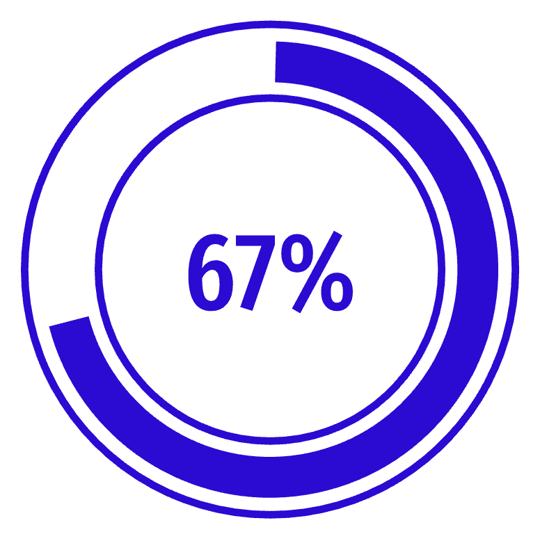
+30%
Key Takeaways
Managing Stakeholders & Collaborating Cross-Functionally
By leading regular design critiques, mentoring junior designers, and fostering cross-functional alignment, I ensured design decisions were data-driven and user-centric. I learned to proactively prepare for meetings by asking myself strategic questions such as "Will asking this question actually help advance the project?" and "Can I gather this information independently?" to built trust and user-centered designs.
Building User Trust Through Brand Alignment
Through user research, I learned that brand misalignment—in this case, the name "SpeakEase" resembling "speakeasy" and an outdated color palette—can undermine user trust. By leveraging data-driven presentations and securing stakeholder buy-in, I led a rebrand to "SpeakWallet," aligning the product’s brand identity with its core values and boosting user trust.
Optimizing Visual Design for Clarity and Simplicity
In visual design, I learned that simplicity is crucial for clarity and a seamless user experience. I focused on minimizing unnecessary elements and ensuring key actions were easily identifiable. These design improvements reduced cognitive load, enabling users to navigate the app easily, while strengthening usability and accessibility.
Next Steps
Improving Design Processes and Team Communication
While I introduced and implemented Agile methodology, the next steps would include optimizing the design system for better consistency, and improving the standardized ticket templates for clearer task tracking. Additionally, it would be helpful to further organize the shared language document to enhance communication across design, product, and engineering teams, ensuring alignment on design and security terms.
Enhancing Key Feature Usability in Varied Environments
Since the voice feature is a key differentiator for SpeakWallet, further testing in real-world environments like noisy public spaces or in quiet spaces could have refined the voice interaction. Adapting response time, tone, and clarity based on noise levels would improve usability. Additionally, refining and testing the conversational design—focusing on how the chatbot responds and its emotional impact—would help balance effectiveness with approachability for users.
Refining User Experience With More Dogfooding & Usability Testing
I plan to leverage dogfooding more effectively and integrate iterative usability testing more consistently throughout the design process. While engineers conducted dogfooding during the alpha phase, continuing this practice consistently into the beta phase will ensure real-world feedback as the product evolves. By expanding usability testing and encouraging cross-functional teams to engage with the product in real-world workflows, I can make better data-driven design decisions.